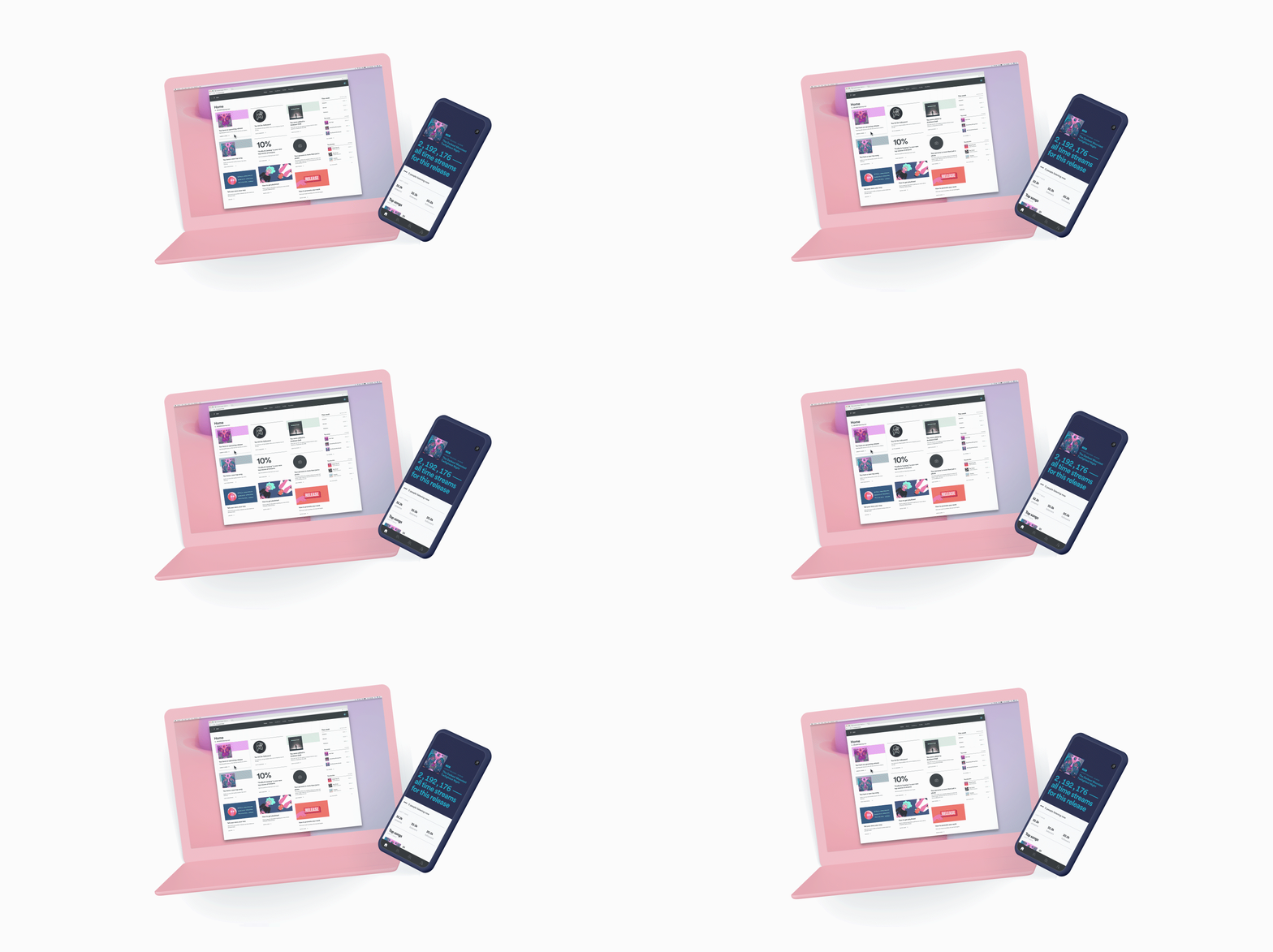
Home on Spotify for Artists
Evolving the creator platform into a personalized, programmed and emotional experience that highlights relevant content and provides actionable guidance for artists and their teams.
My role
Product Designer
Time
March 2018 – June 2019
My focus
Lead the design and strategy for Web and Mobile for the new landing experience in the Spotify for Artist analytics platform for artist teams, in partnership with internal teams across Spotify.
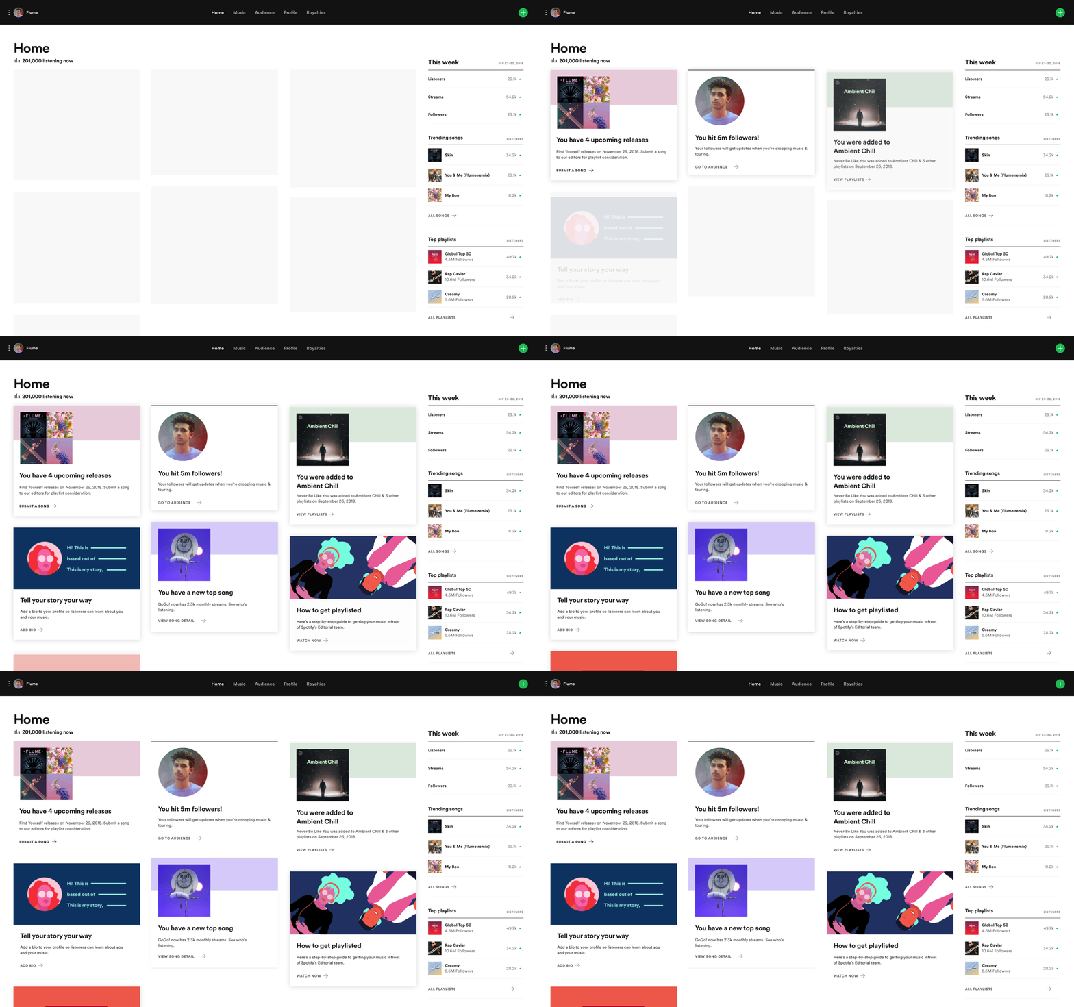
Spotify for Artist Web
Context
At the time Spotify for Artists provided a collection of tools, but they don’t tell a cohesive story or provide actions to help empower and guide artists in their careers.
Solution hypothesis
By developing a relationship between artists and our platform, we can help artists feel supported, empowered, and proud by guiding them to take actions that further our goals of building a two sided creator marketplace.
Team
1 product manager
3 engineers
1 user research
1 data science
Metric goals
Drive >20% engagement with features across platform
Drive increase of 10% or more in time-bound features (artist’s pick, new release window)
Experience principles
Personalized, Insightful, Action-driven, Emotional, Delightful
Foundational learnings: 3 artist & 2 managers
We conducted an initial round of user research to probe into how users react to how communicate information on Spotify for Artists. (ie onboarding emails and playlist additions)
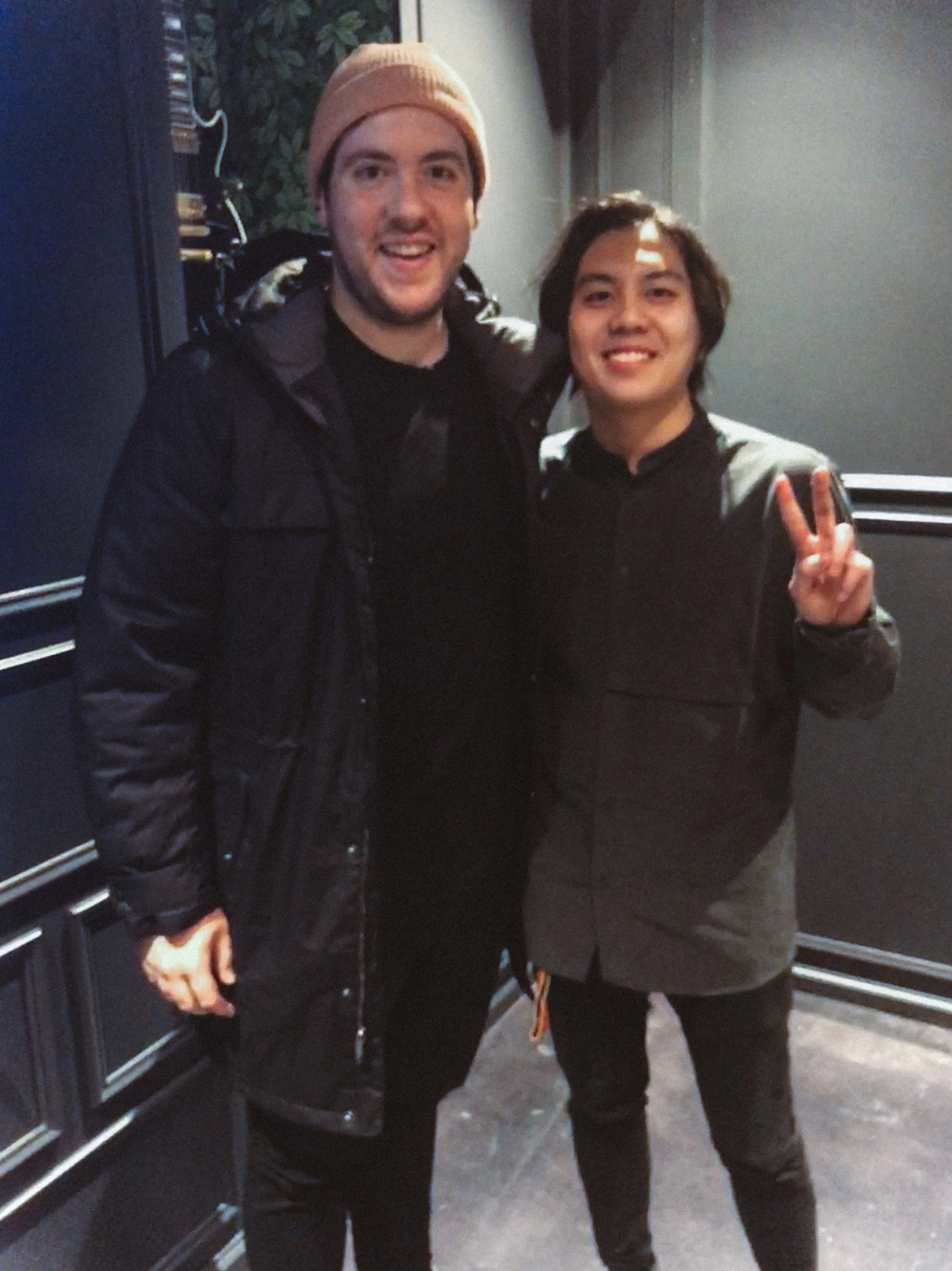
Artist participant (Shallou) and I
📲 Preferred in-app communications
These users are constantly checking the application, so it wasn’t helpful to receive emails of information they most likely already are in the know. In-app style updates would help cut through the noise.
🔔 Hesitant interest in push notifications
Participants mentioned they’d be interested in Push, but would want the option to turn it off as well as a way to tailor frequency and type of content
🫂 Everyone wants more guidance
Majority of the users wanted more information on how to best utilize the tools on Spotify for Artists, when and how they can measure or bench mark their success.
Usability research: 4 Artists & 3 Managers
We conducted a second round of research to understand how we can drive user behavior and engagement with centralized locations of in-app style guidance and alerts.
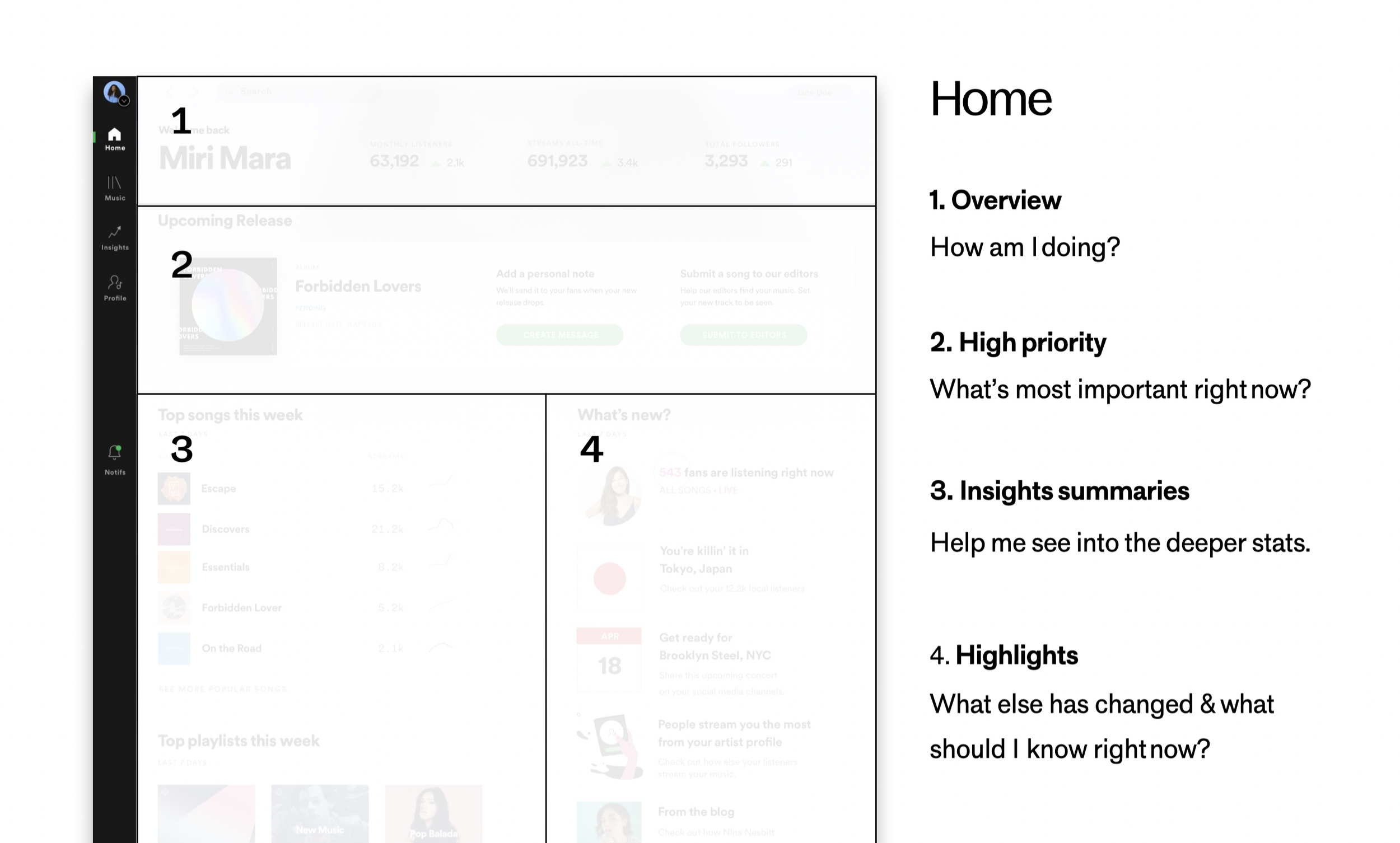
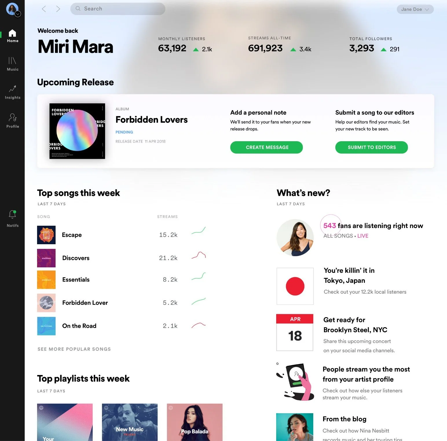
Artist Home
A space to surface timely events & insights, providing users with an overview in order to help them: develop a meaningful connection with their data and be exposed to more Spotify tools, receive guidance, actions & recommendations.
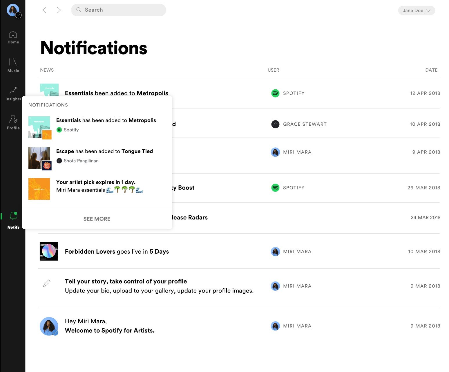
Notifications
A web notifications feed will provide an inbox of important and timely alerts to: inform the user of significant events, confirm actions, and product news.
Insights
Participants more meaningfully navigated the experience
Participants expressed a preference for an overview and used home as an entry point to different features throughout the product.
Expectation: highly dynamic and personalized
Participants also believed that the prototype would be highly dynamic and personalized to guide them on the platform based on their background.
Confusion around notifications
Participants expressed a lack of clarity around purpose and information within the notifications tray. There was a noticeable shared mental overlap between Home & Notifications.
Iteration and build
Shipped in Spotify for Artists Labs
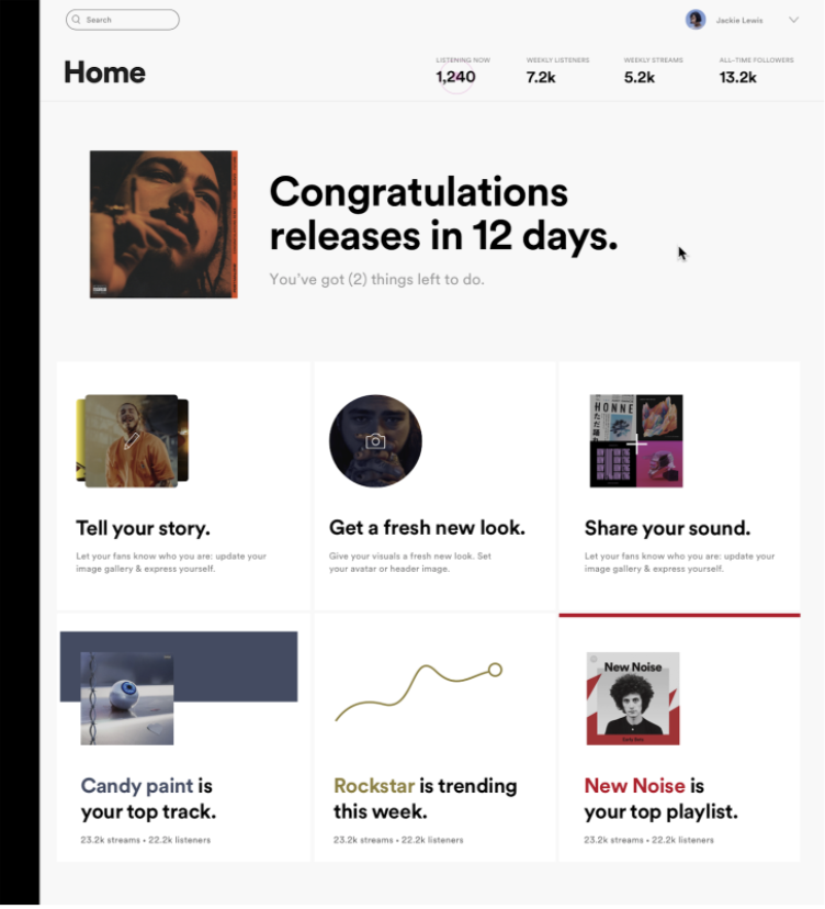
Coming out of user research, I quickly designed a simple overview focused on the last week in streaming for the artist, leveraging the artist’s artwork, imagery, and live viewer count directly on the landing page to help make the page feel personalized and lively/emotionally resonant.
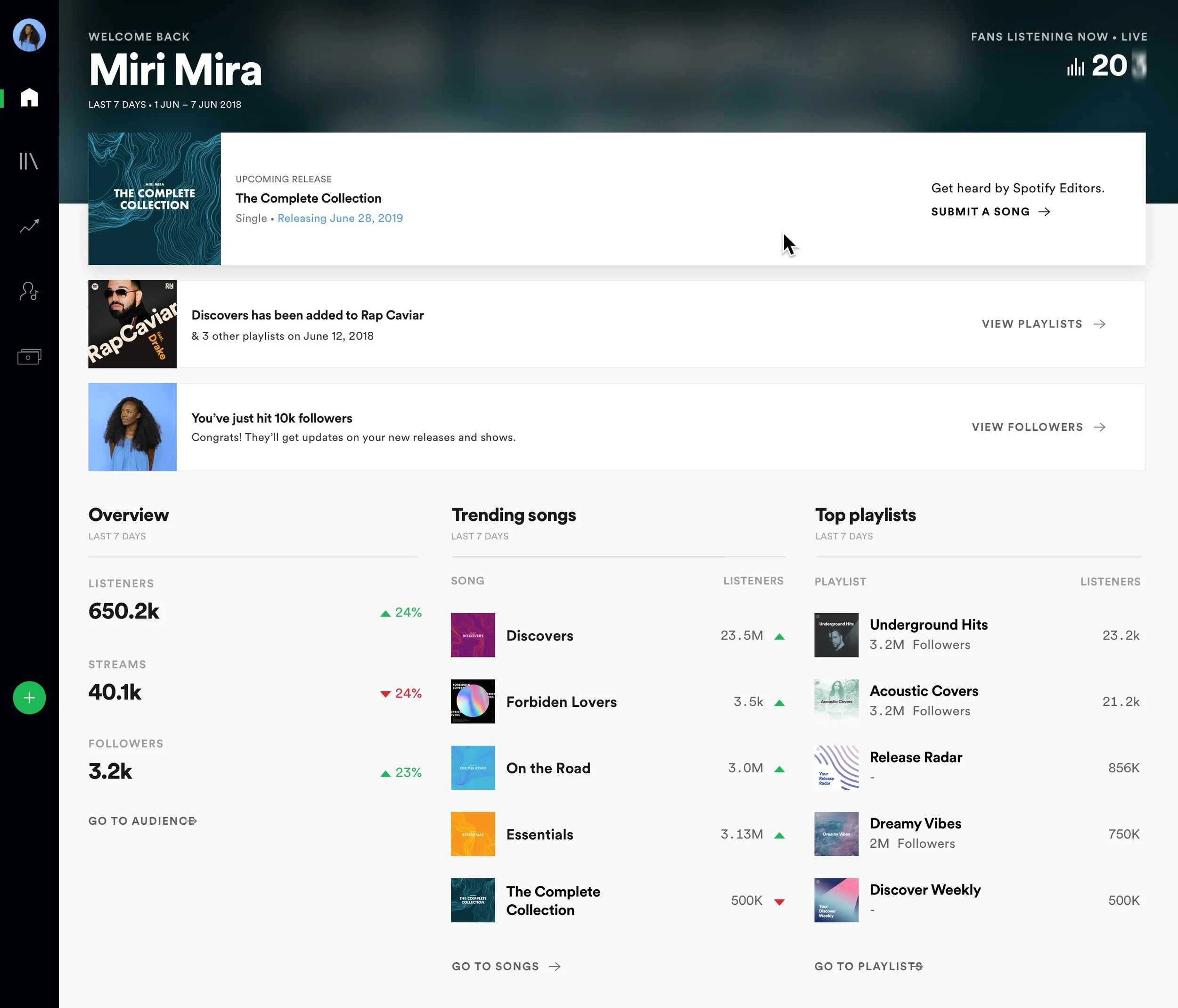
Example of new releasing artist
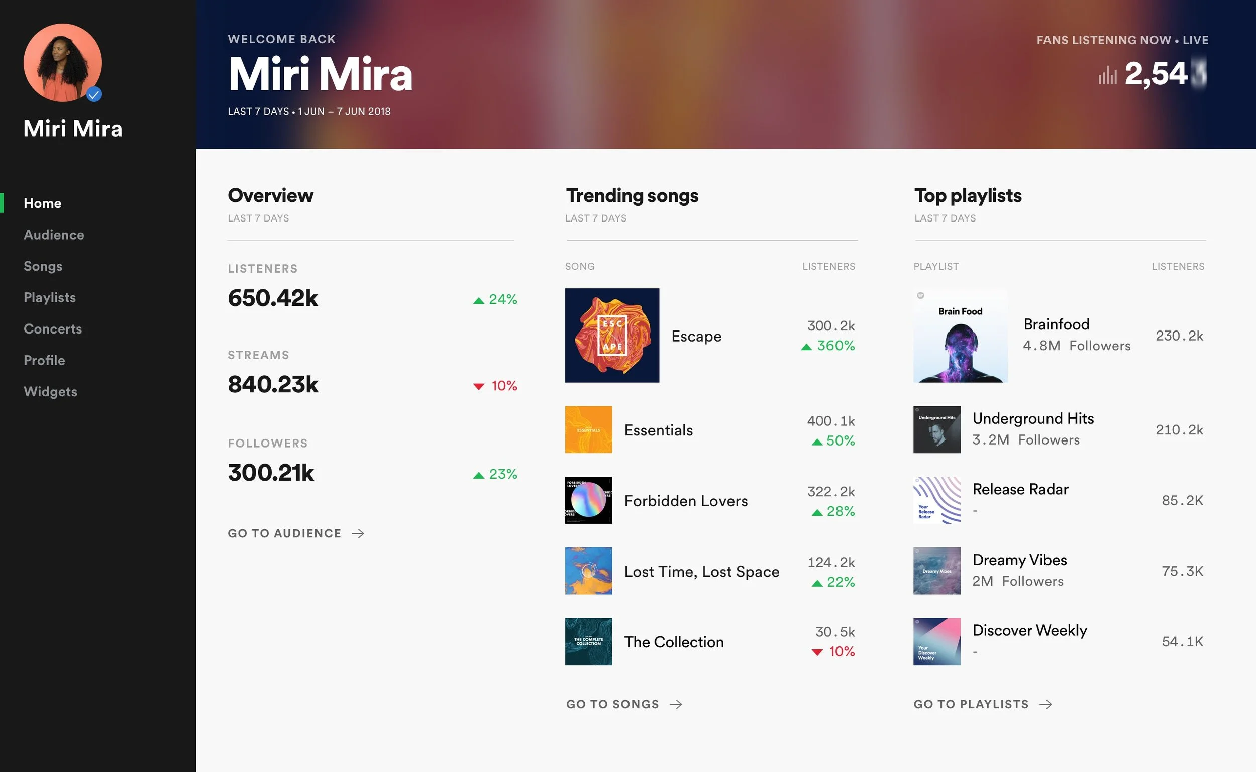
Not releasing artist
Iteration & prioritization framework
But as we scaled our platform to new features across the product, there grew a growing need to provide actionable guidance for our users. Our current layout was limiting the amount of information we could easily provide for our users.
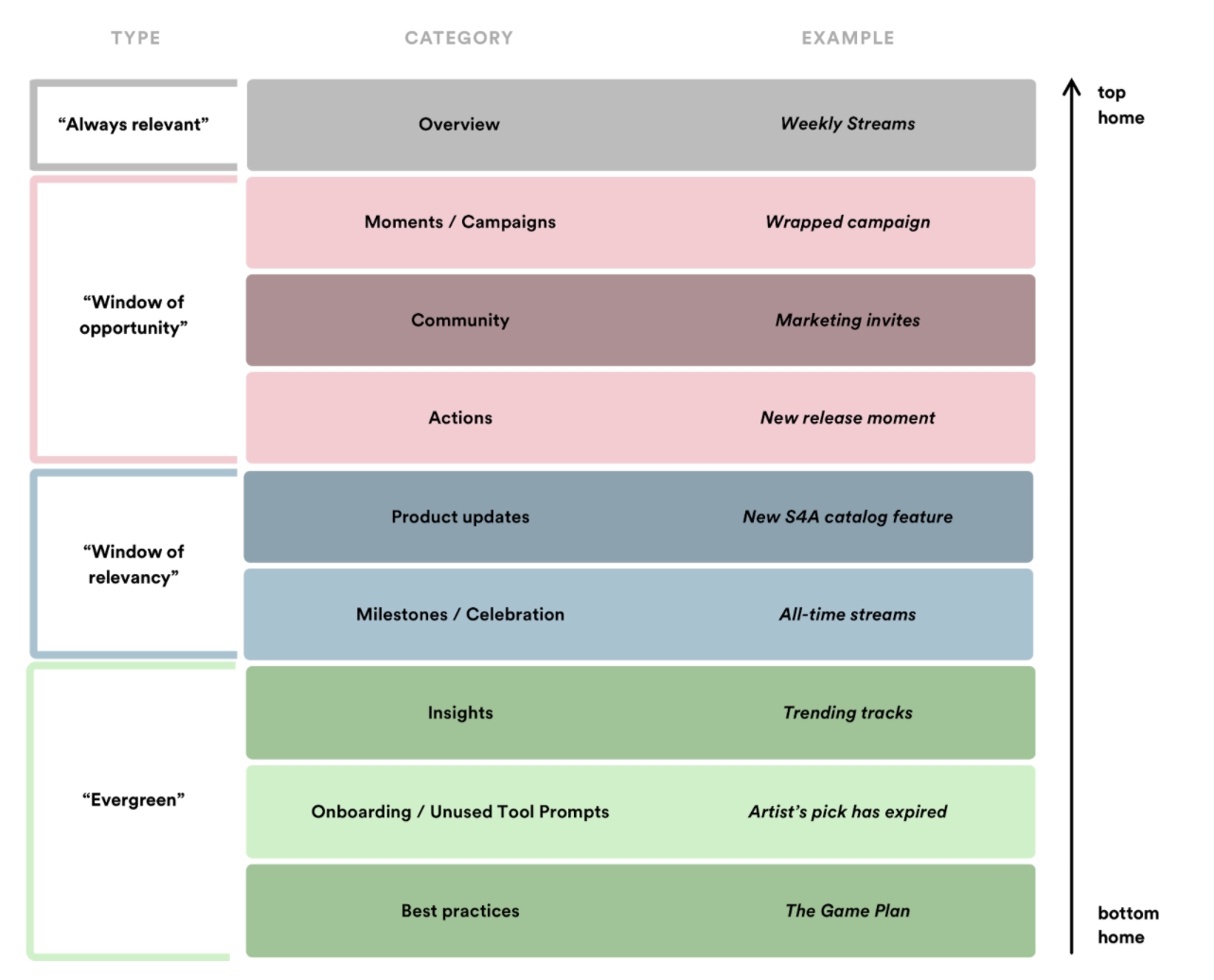
We met with all product and marketing teams to understand the features and types of content categories our home experience needed to support.
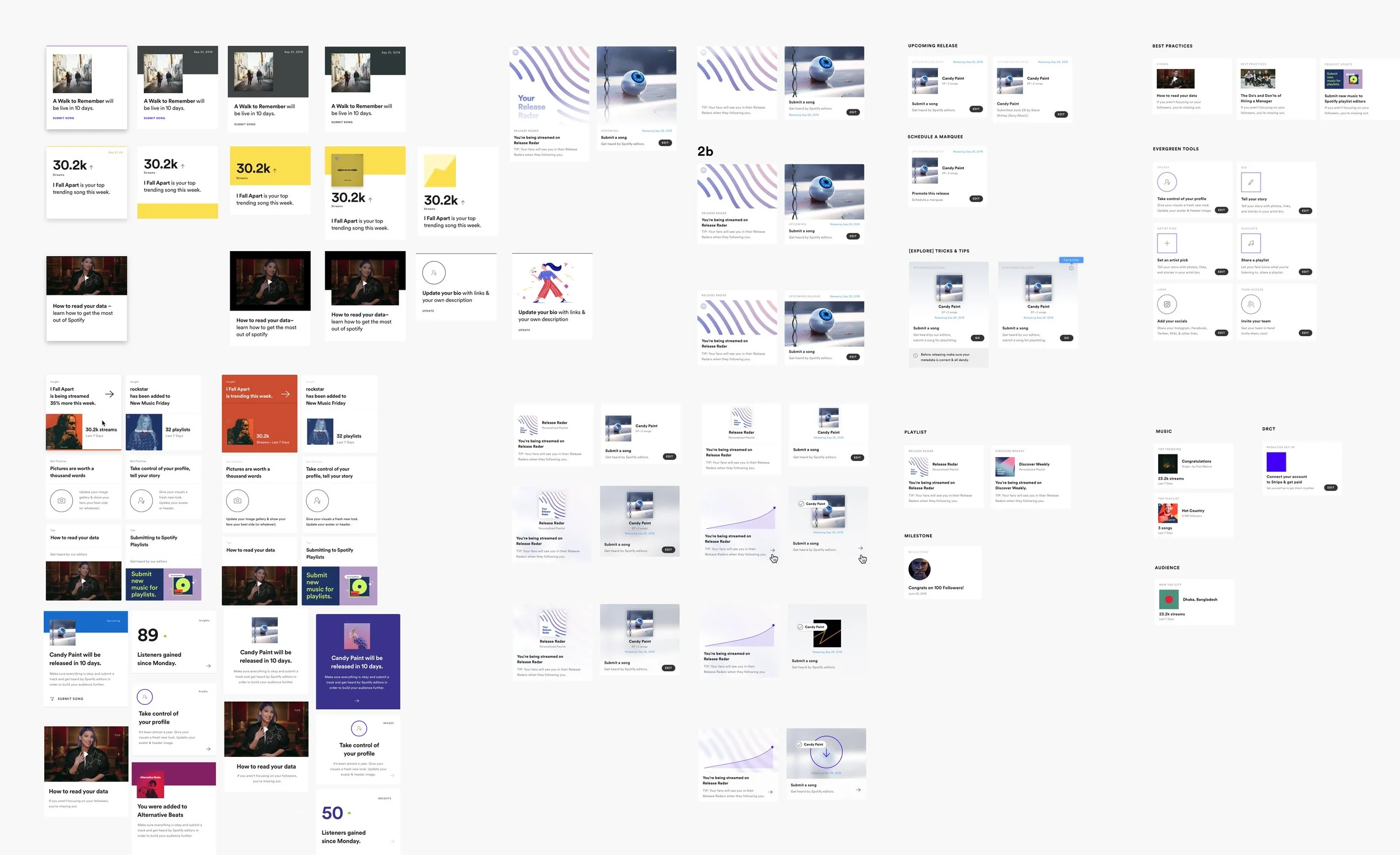
Various card style explorations and content hierarchies
Workshopping styles, formats, values, tags, sizes, colors, etc. for individual card templates among team designers In order understand what kind of support feature teams needed and what new tools or insights were being developed, I consulted with all creator teams on form, function and use of a home card system.
Encorporation into information architecture
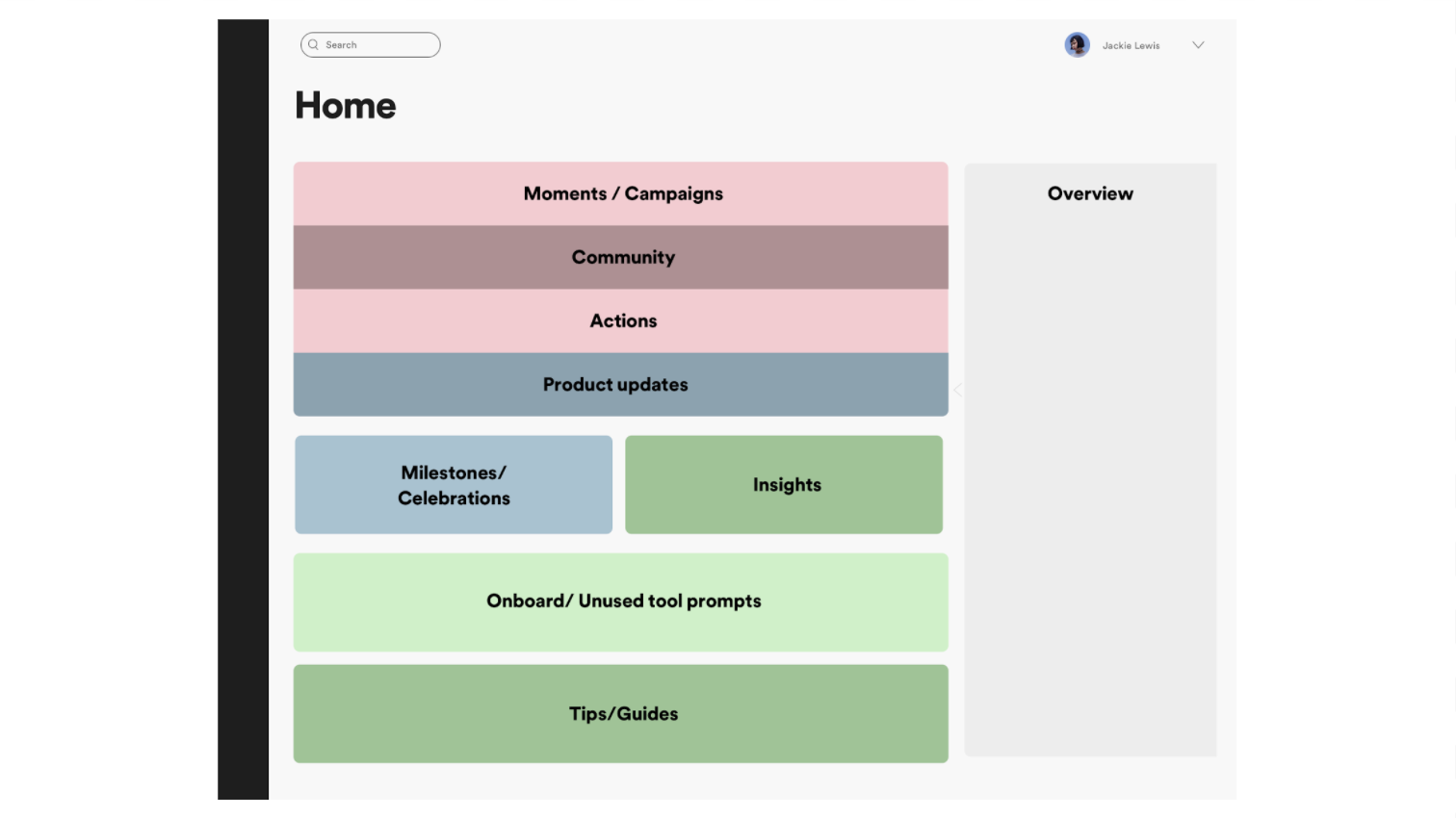
Incorporating existing designs of a data overview with programmed actions and insights was a tough challenge in evaluating a balanced information hierarchy.
Option 1
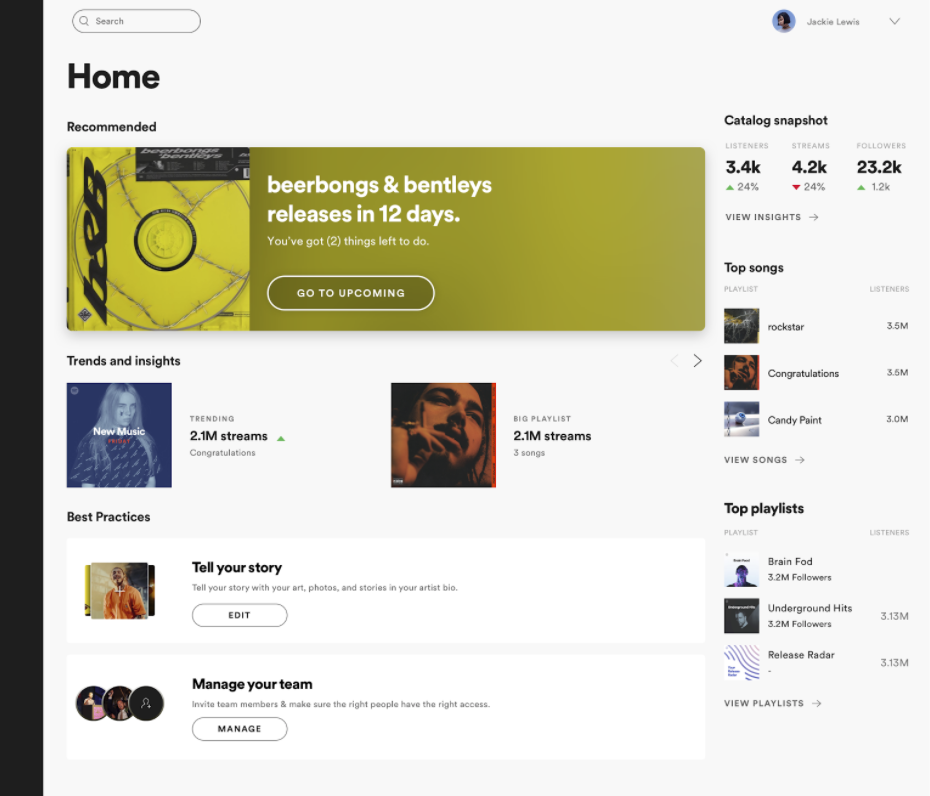
Option 2
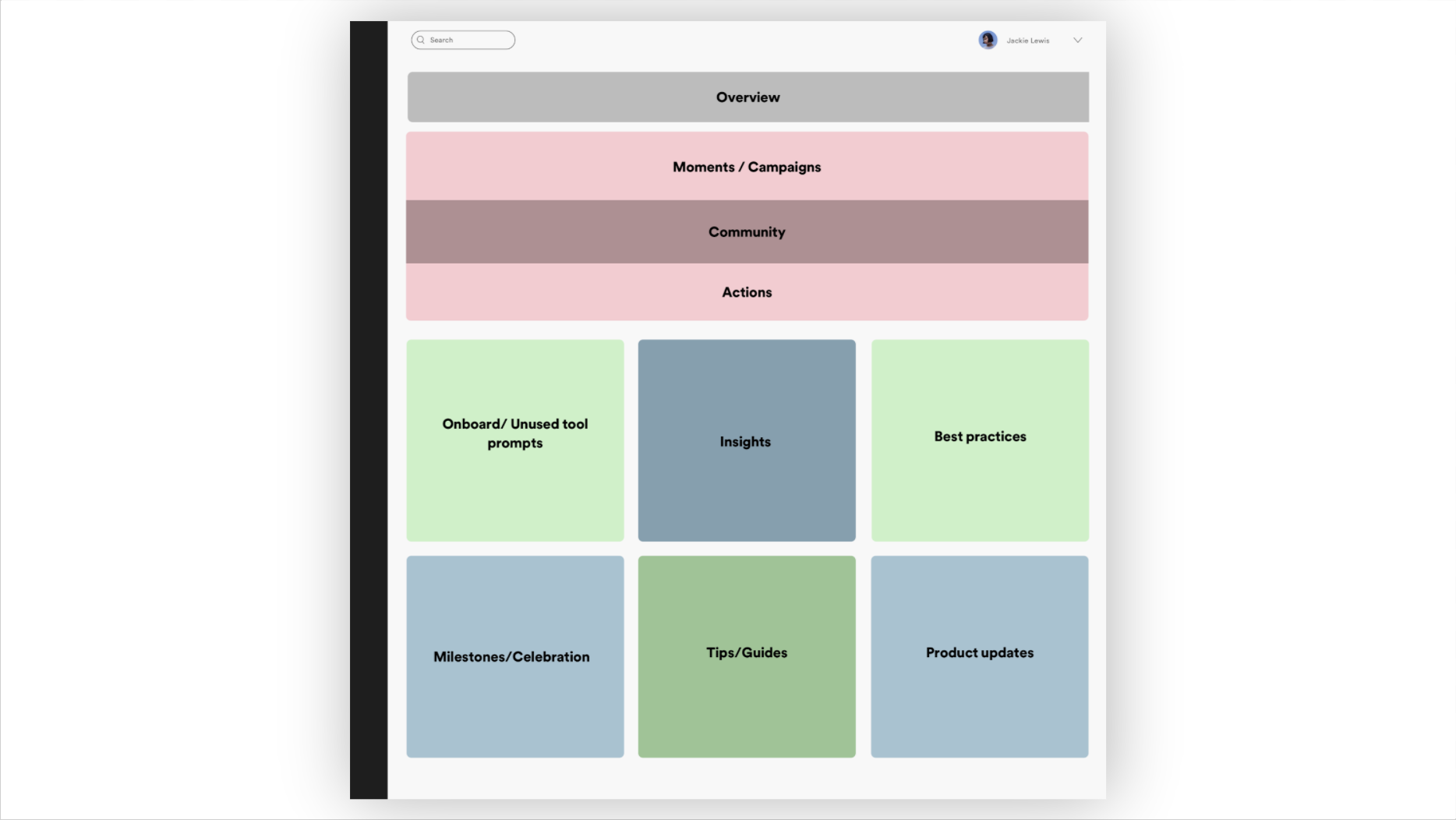
Finalizing web information hierarchy
Synthesizing feedback from the team we designed a compromise that helped maintain a sense of hierarchy of information whilst, creating a platform for action & experimentation first content.
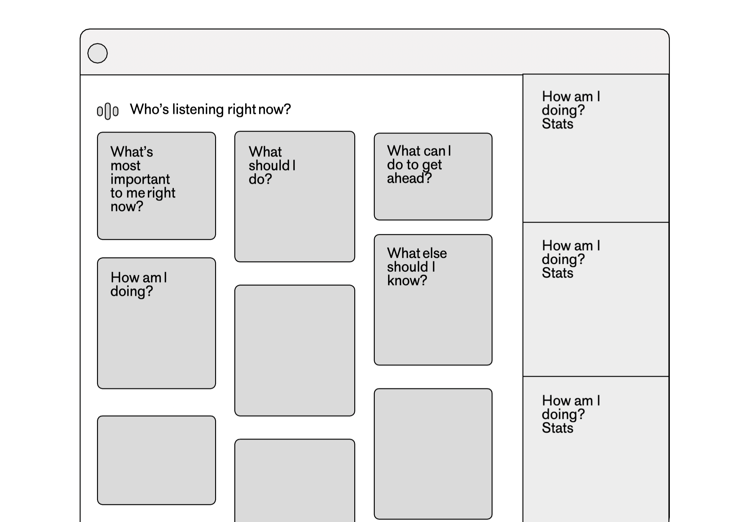
UI template for home
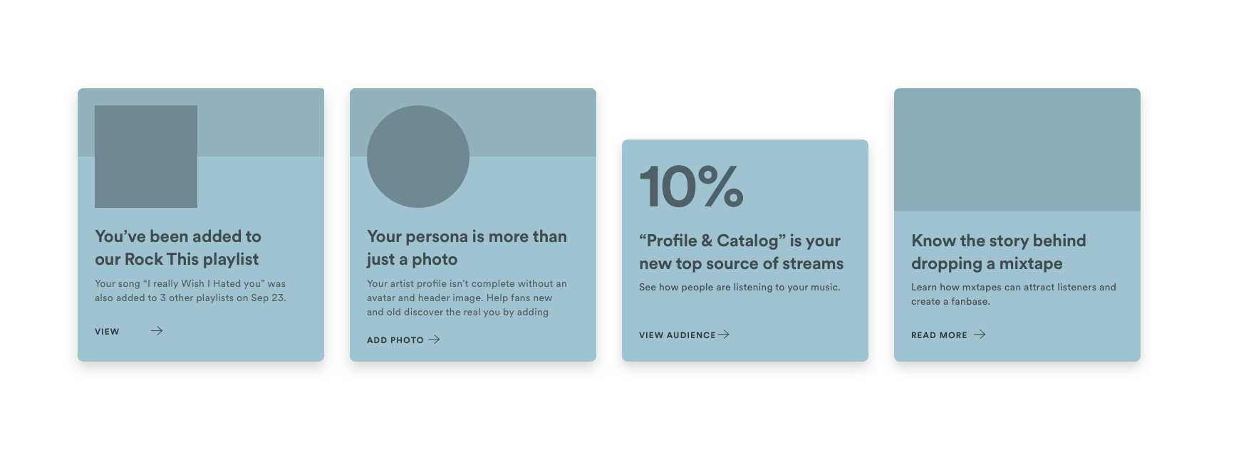
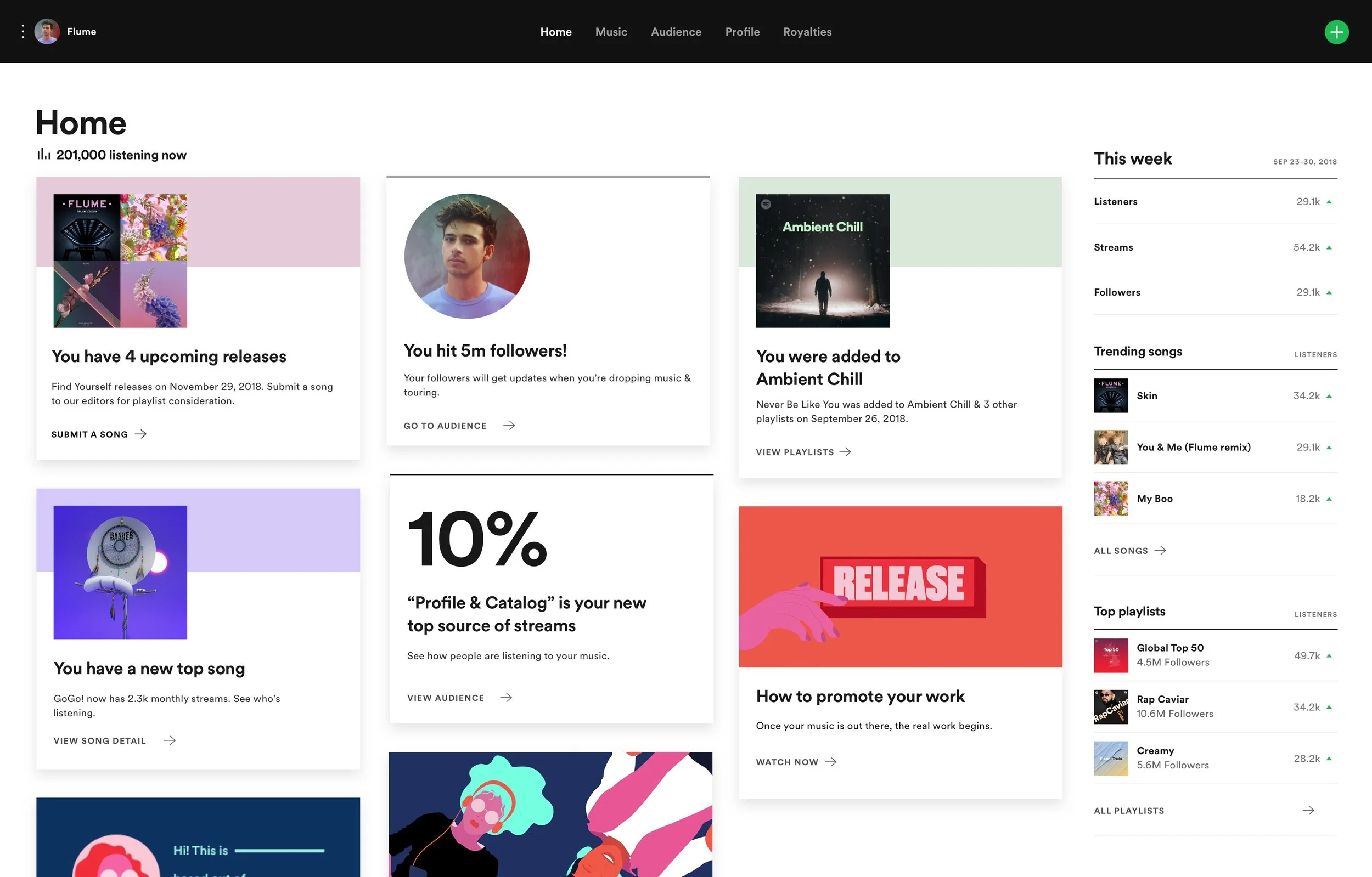
4 card template formats
I designed a set of minimalist templates to suit our baseline needs across the existing feature set to drive action. We’re continually experimenting with content and format.
Guidelines and driving internal contributions
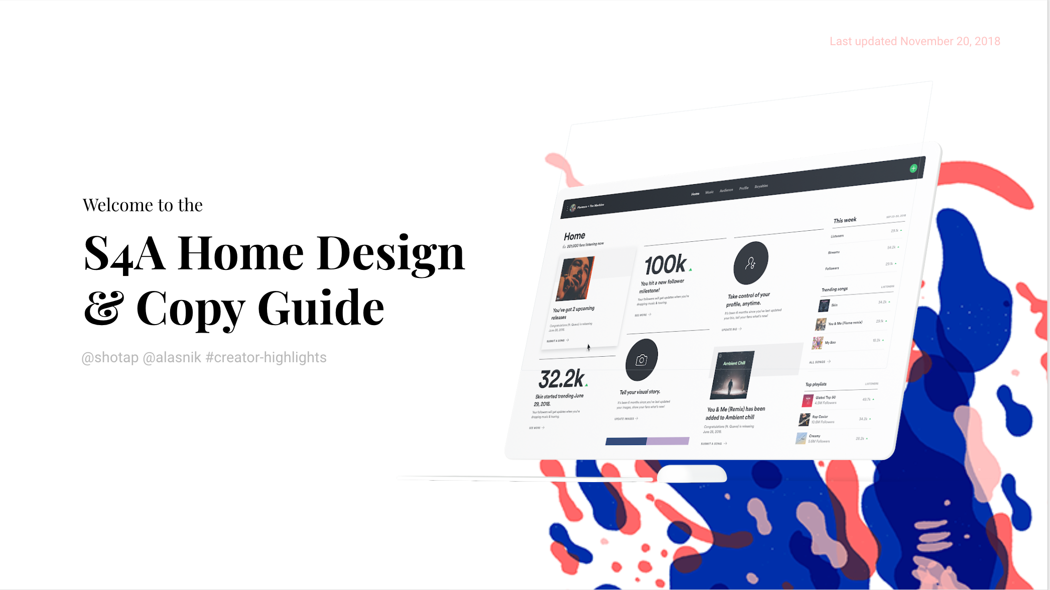
I worked with a senior UX Writer on a guidebook to drive feature teams to plug-in and experiment with card templates. This set the standard at the company for the ability to rapidly test styles, copy, and features.
Final design and impact
37%
average card engagement
2x
driver for feature usage
10%
revenue for SoundBetter
Bringing artist home to mobile
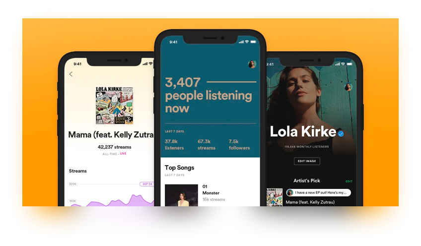
In collaboration with our mobile team, I worked with one designer to bring the mobile experience up to par with our quickly moving web platform. I embedded with him & their team to help kick off the effort.
I focused primarily on home & he focused on updating the music stats page.
Problem
There was an increasing disparity between the web and native app experiences. As we continued to grow our platform we were missing investing in a key strategic lever creating a broken experience.
Value / Opportunity
New, on-cycle users who view stats on their mobile app within their first week on S4A will retain at 85% over a 60 day period. Those who did not view their stats retained at just 50%. Mobile is a key metrics driver.
Cross team workshop
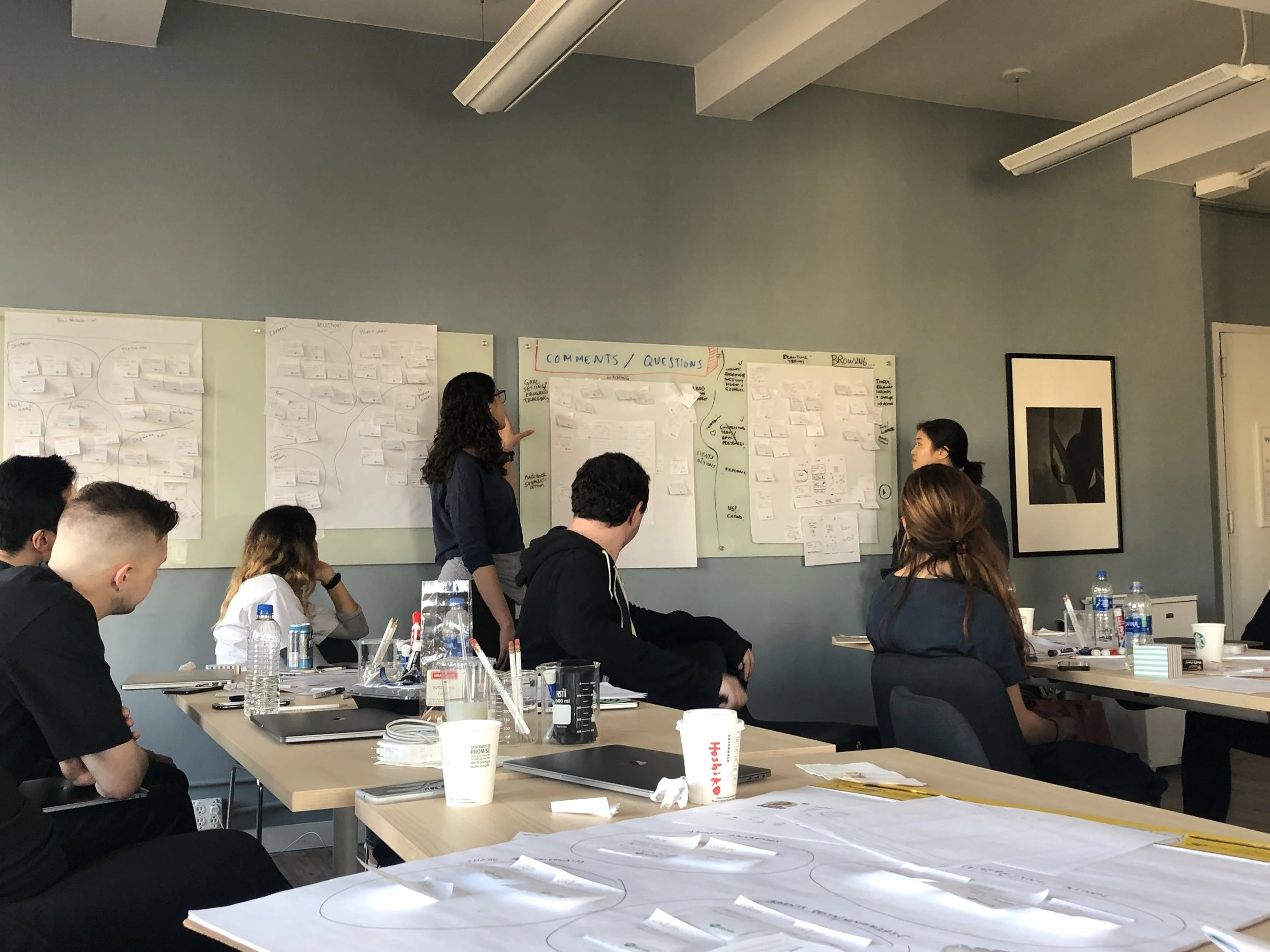
Partnered on a cross-team workshop, bringing together the mobile team, insights team, and representatives from others to brainstorm on the next evolution of Spotify for Artists on Mobile.
User research
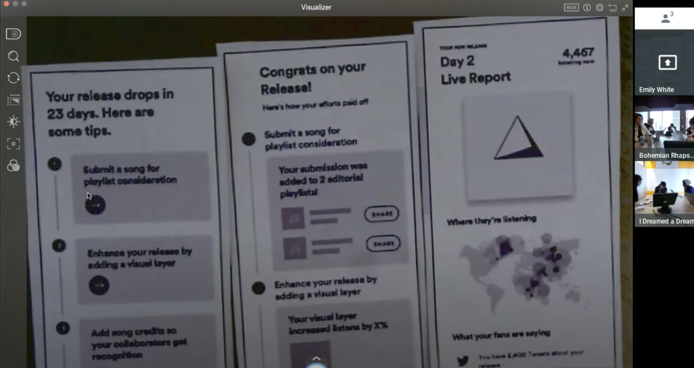
We then held a user research to understand the value of different features on mobile & user behaviors on the go on the third day of the sprint.
Prototypes
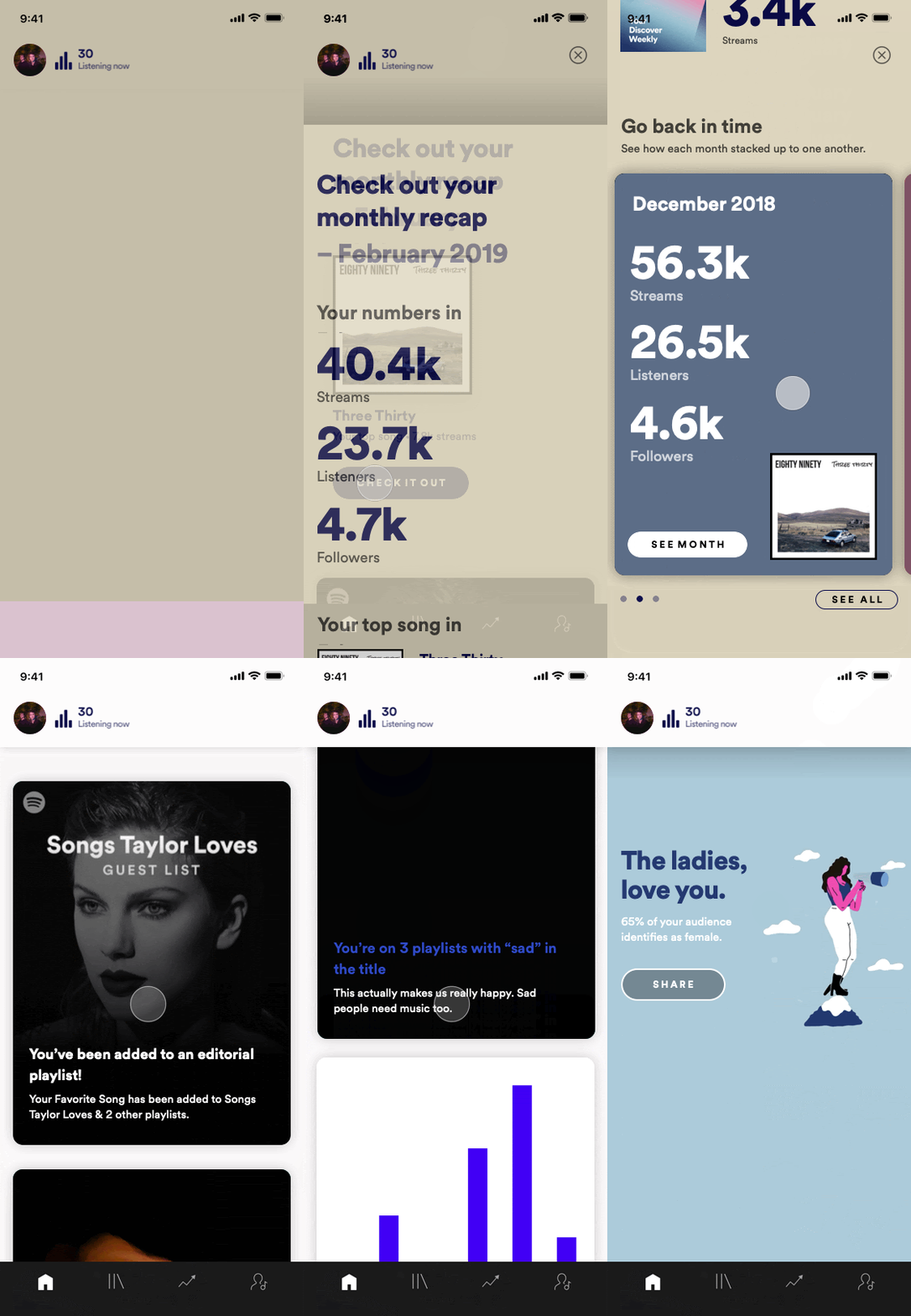
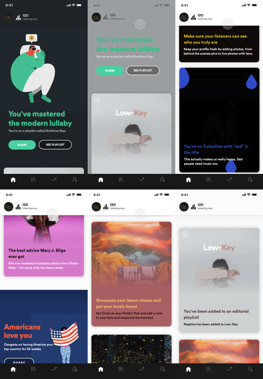
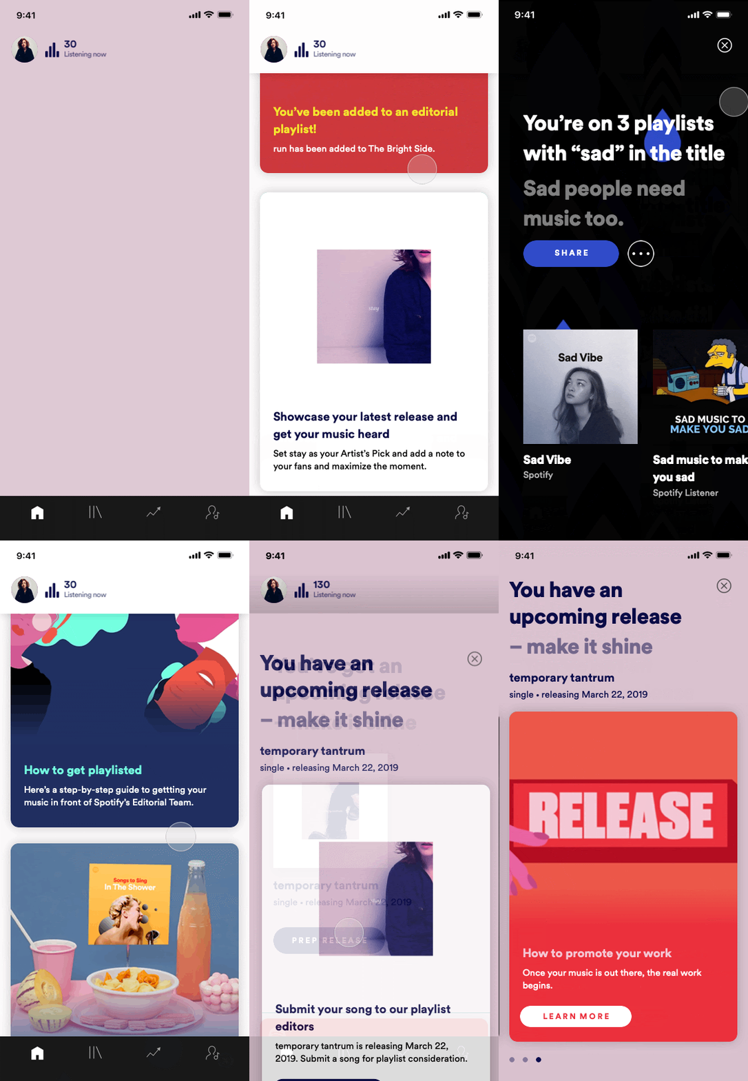
On mobile, we wanted to make the home experience feel timely, lively, and engaging with insights, actions, and recommendations abundant and center-stage.
Key insights
Feature parity is an expectation at minimum
Users expected on par functionality and feature set on mobile. Some expected mobile specific differentiated features.
Low-risk, high frequency/urgency tasks
Our participants all noted that they use the application for high frequency & timely tasks but would prefer to perform higher-risk actions on web.
Simplicity & ease of access
Users still see the application as a utility, not a place to spend too much time. What’s most important should be easily usable & accessible.
Iteration & build
Simplify the experience, focus on programming the most timely & high frequency tasks
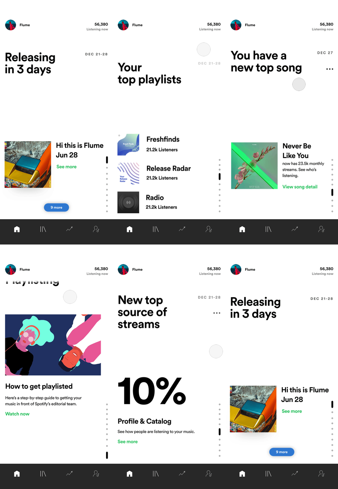
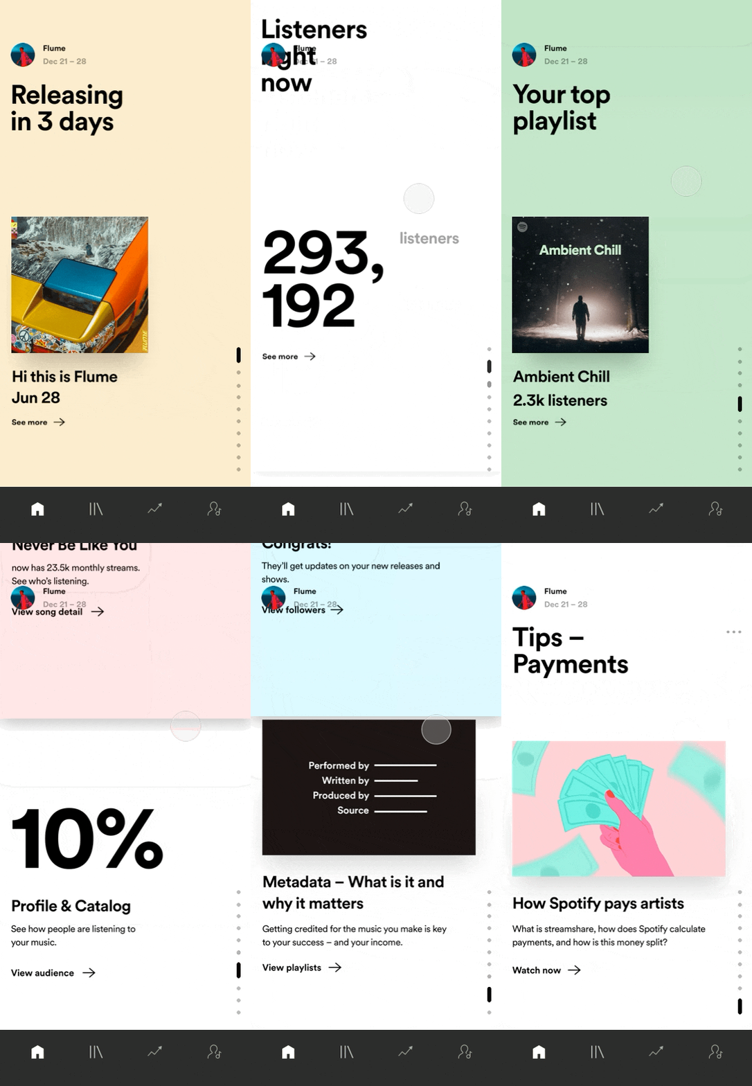
Visual experimentation with a similarly bold & text forward approach. Editorializing the experience a little more.
What’s the best model of traversing content? Card Stack? etc.
Time & constraints
Due to timeline & tech constraints, we focused on propping up existing card “templates” over a new UX paradigm from web. With limited time to bring feature parity, we focused on doubling down the value opportunity of making the home experience lively, engaging, and celebratory
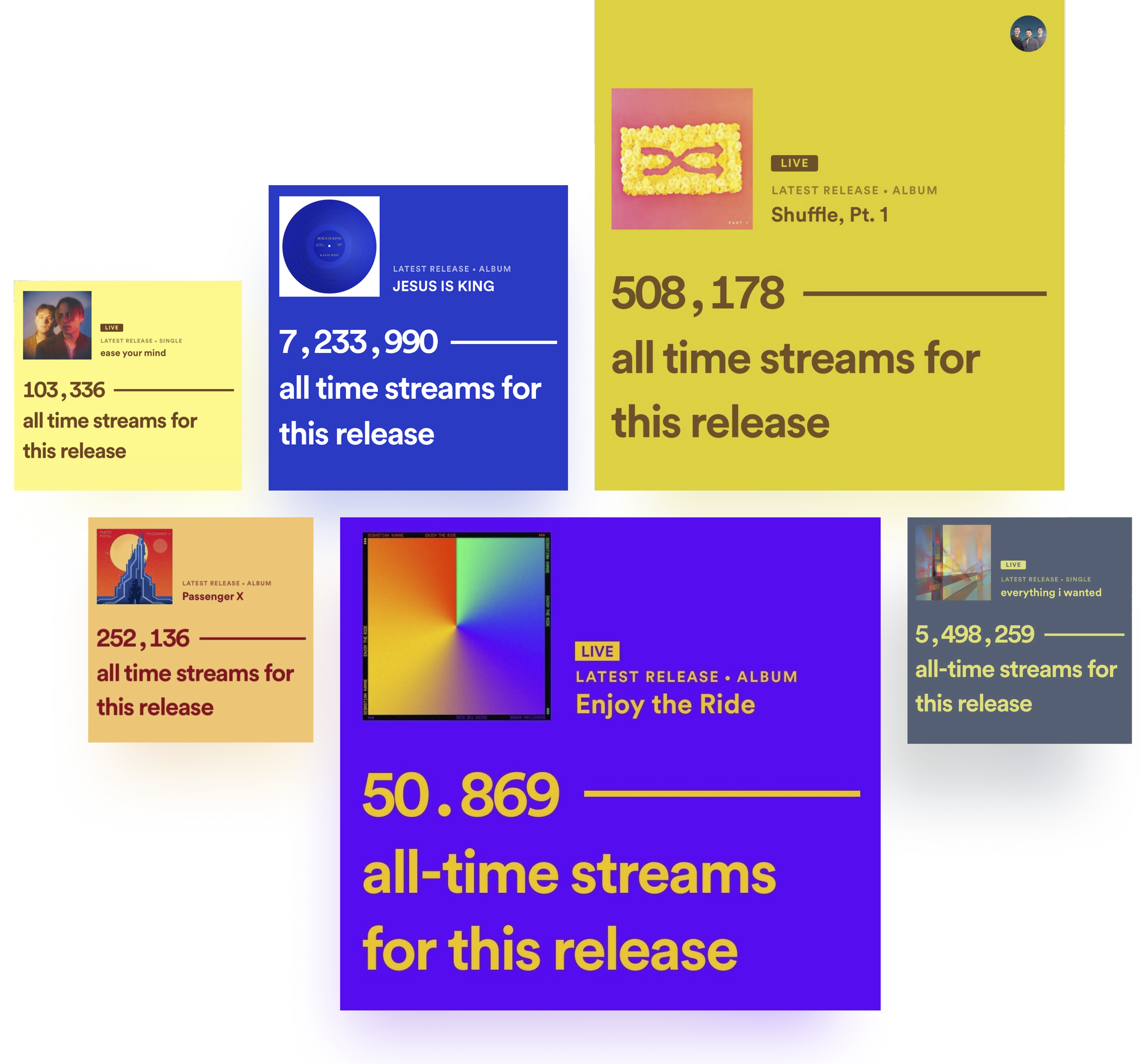
Experiment with color values
Using color is tricky, but we wanted to make the release moment really “pop!” Since it’s the most exciting and scary moment in an artists career. I worked very closely with my engineer to develop a set of rules for a color-picking system that evaluates a palettes colors and creates an accessible two color text + background pair with special logic.
Supporting small, large, and off-cycle artists
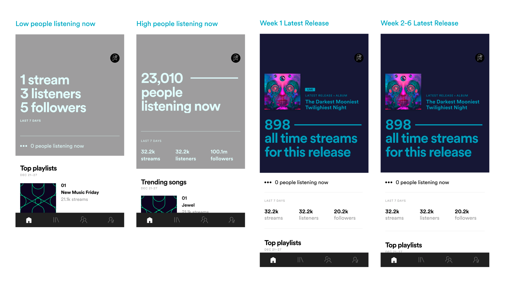
Designing for every sized artists means creating divergent experiences! I worked with my data scientist to predict the likelihood a user would at least get 1 listener in an hour, otherwise the layout moves around to emphasize other info.
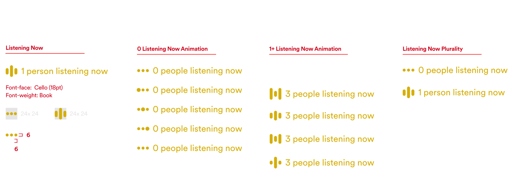
Motion with Lottie/AE

Live prototype build usability testing
Usability tested a live build of the experience with 4 artists & 3 artist team members in Los Angeles.
Positive reaction to home experience
“I like this homepage landing on this… it’s helpful.” Participants saw the surface as a place of added value.
Too much content
Participants noted the overwhelming amount of content for them to learn about or take action on
Build issues
The build had a number of untamable areas that were buggy which cause a bit of confusion when testing.
Final design
We followed up with bugs, tweaks, that landed us to launch on tight timelines.
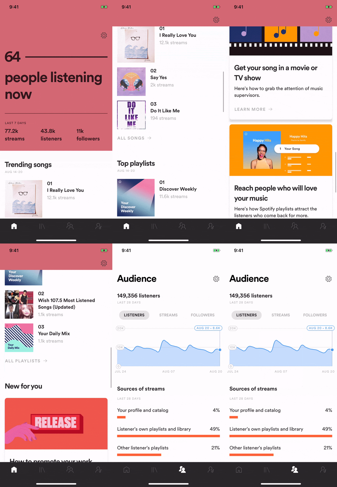
Fixed moments where tappable elements weren’t correctly linked.
Changed trending songs (an algorithmically generated trend point) to top songs for simplicity.
Reduced the amount and type of cards to be mobile specific only.
Outcome, impact, and reflections
Results
0% change in User retention
There was an overall flat retention rate in the following 60d retention.
8% higher engagement for home
Our mobile experience engagement is 45% higher than our web experience of roughly 37% the following month.
But…lots of positive sentiment!
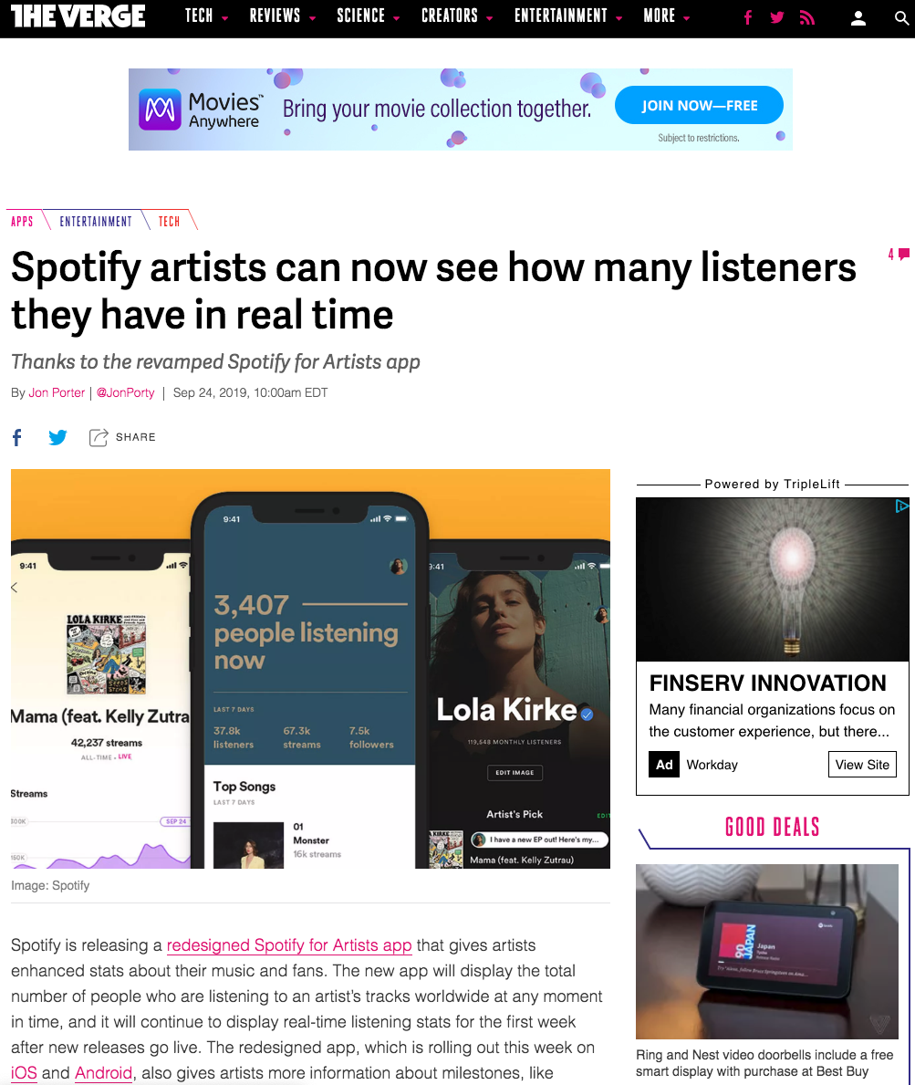
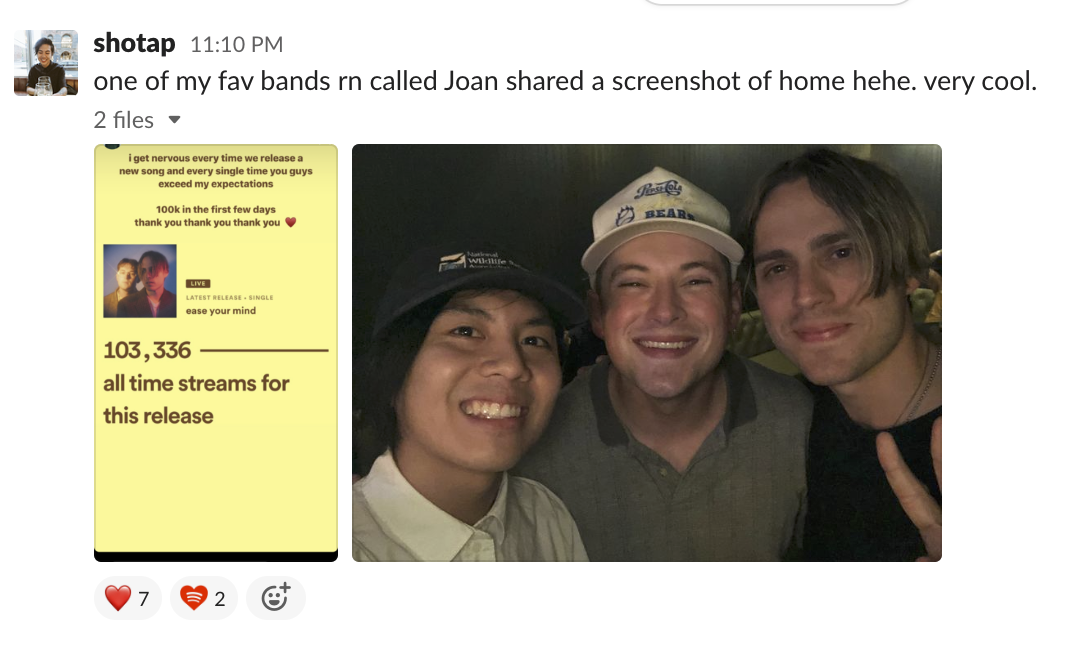
A lot of social sharing and positive sentiment surrounded our colorful hero.
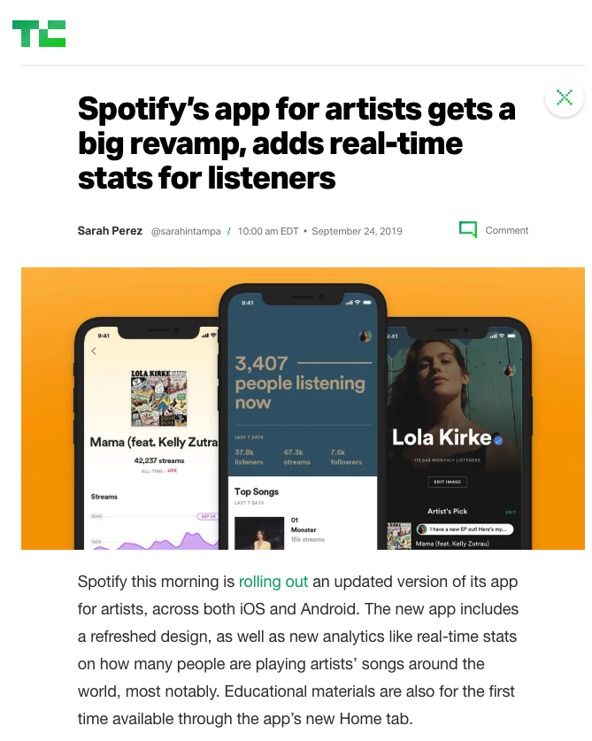
Large amount of press (20+) and social engagement continues to this day by artists!
Looking back and reflections
This project required months of discovery, research, collaboration, and convincing to unlock. If I were to return to the project again, I would try to push harder against our team leads and product managers to delay our launch date by a month to A/B test and build out some alternative navigational experiences, but due to timelines we were unable to do so.
Overall, this project was one of the most rewarding because of the continued impact I see in artist’s careers and the sheer scale of what I was able to work on at such an early stage of my career.