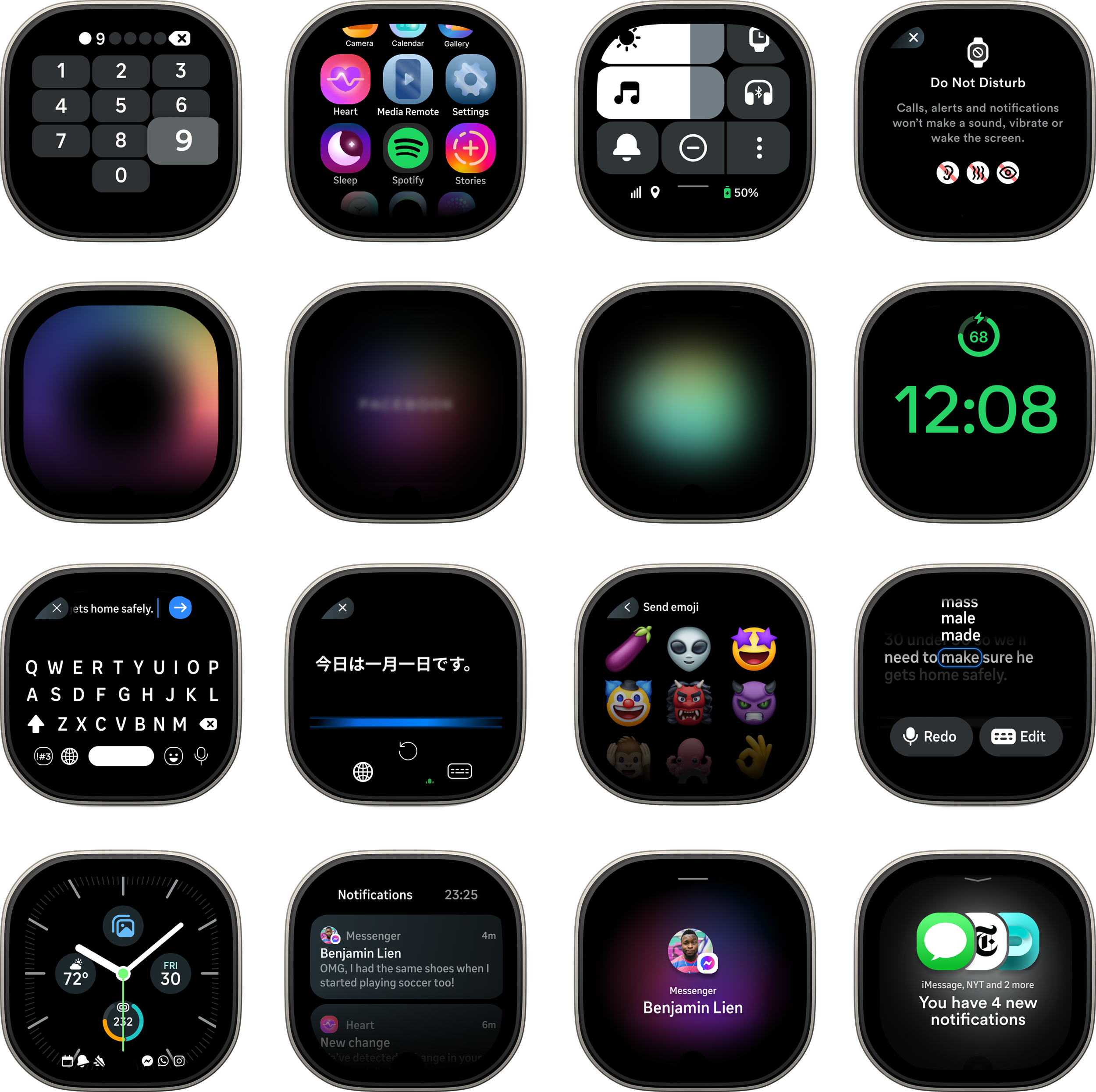
Building a foundational operating system from scratch, for Meta Reality Labs
I designed the navigational foundation for a wrist OS, building a multi-camera, detachable wrist wearable. A companion aimed at younger audiences experimenting with new tech — one designed to help them capture and share a moment, stay close to the people who matter, and stay present without missing a beat.
My role
Senior Product Designer / OS Lead
Time
April 2021 - October 2022
My focus
Led the design of OS device capabilities and explored multi-device interoperability.
The product lacked a core navigational model at its inception
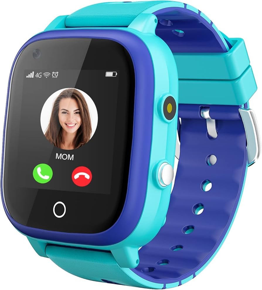
The product had no clear navigational mental model to guide our users, relying on existing patterns from legacy digital watch experiences.
At the time, these were the patchworked experiences I mapped based on what existed thus far.
So the design problem was twofold: define a navigational model people could learn instantly, and make it exude the ethos of our core mission – staying present without missing a beat, capturing the moment, and keeping loved ones close.
The hardware didn't exist yet
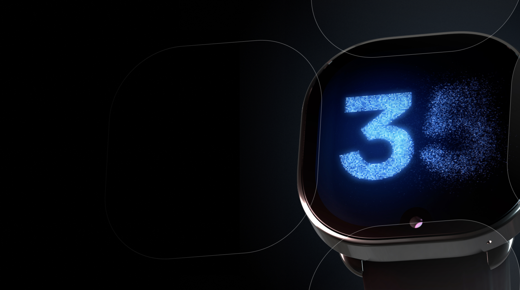
For most of the project, the hardware didn't exist.
So we improvised — hacking our screens onto imported smartwatches and developer boards, validating layouts on hardware that was never meant to run them.
How do you design the navigation for a device that has no precedent, no working hardware, and no agreement on what it's for?
That was the problem I spent my time answering.
This device was meant to be the first generation of computing on the wrist — the foundation for Meta's longer-term AR ambitions, following Ray-Ban Stories into a future of hands-free, glanceable interaction.
This device's soul and ethos were defined by keeping people present and enabling them to capture the moment — with all their needs within a swipe away
.Getting the mental model for navigation and the foundational operating system right wasn't a feature — it was the core of the platform that everything else depended on.
The goal
Align the motion and navigation principles — defining the interaction model between panels and experiences.
Validate the core features — the right location and relationship for each.

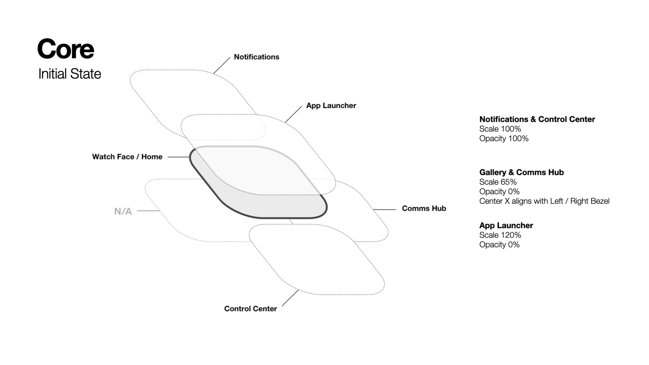
A 4-directional model
I anchored the entire OS on a directional spatial model built on Android architecture. Swipe-based navigation proved to be the best technical decision for the platform.
The bet: on a screen this small, spatial memory beats menus. If each direction owns one job, you navigate by muscle memory instead of reading.
Splitting communications and notifications
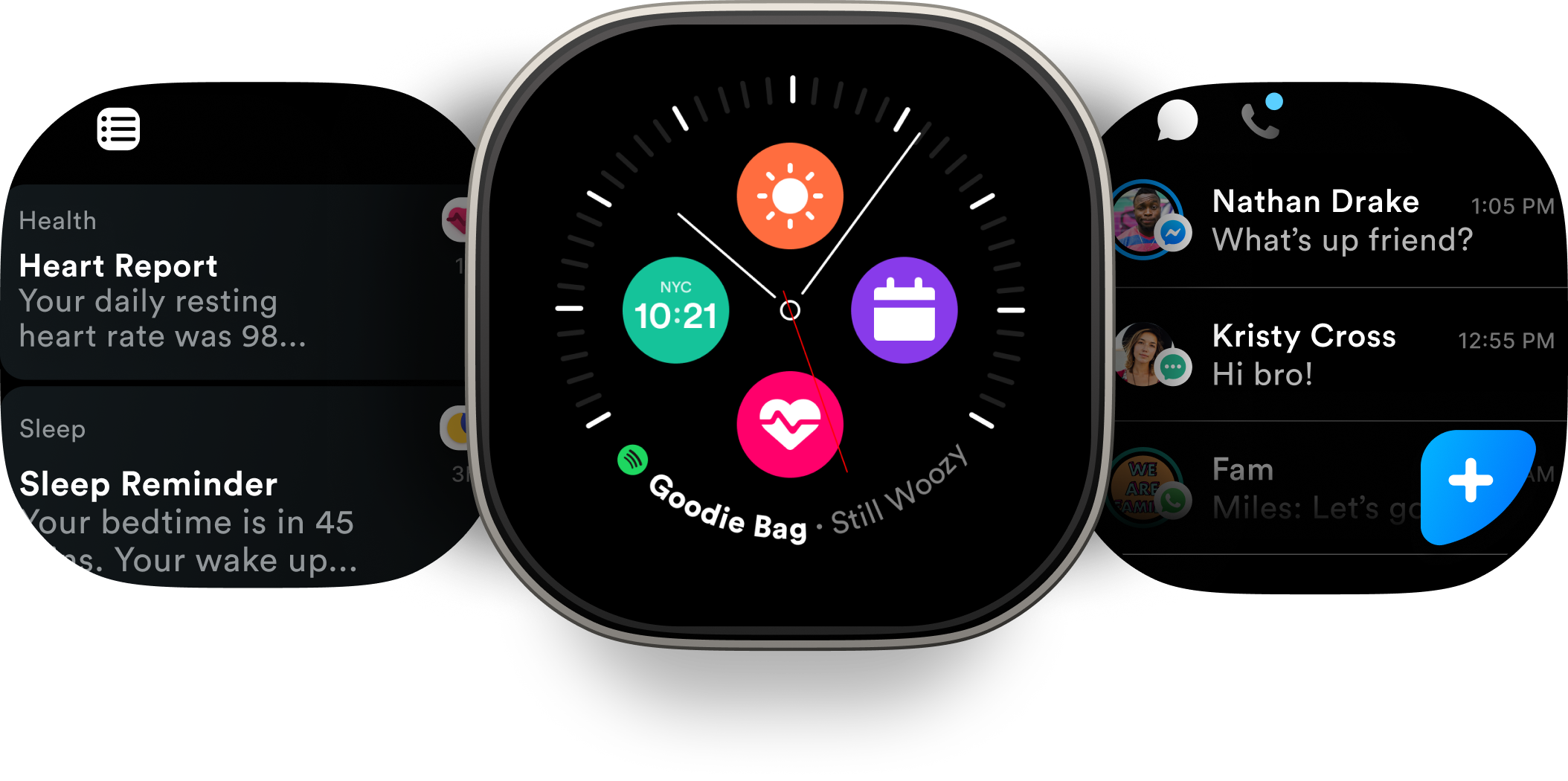
Hypothesis: traditional notification feeds create noise, and noise is fatal on a glanceable device. Keeping them apart makes each stream focused — notifications for what needs your attention, communications for the people you're talking to.
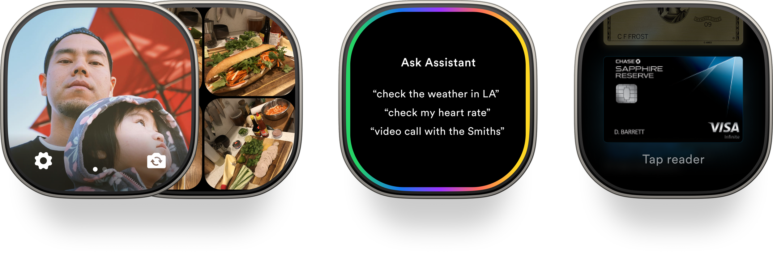
Physical buttons
Hardware interactions were dedicated to camera functionality and quick access to features such as assistant and payments, which we’d explore after establishing this core navigation.
Validation and testing
I ran a week-long design sprint — 3 other designers, 1 PM, 1 researcher, and 10+ XFN and engineering partners. During this sprint we explored motion, experience value, and overall product positioning
2 variations
We decided to split communications and notifications to elevate connection with friends and family. The remaining question was how to position the fourth bottom panel — so we explored two mental models.
Make capturing the moment seamless and top of mind
Quick user access to photo sharing and memory exploration
Left (app notifications) / Right (communications)
Top (settings)
Bottom (shortcuts)
Hardware buttons – Camera, Apps/Shortcuts, and Assistant
Smart shortcuts: get people to the things that matter most
Catch users up with smart shortcuts
Left (app notifications) / Right (communications)
Top (settings)
Bottom (shortcuts)
Hardware buttons – Camera, Apps, and Assistant
Exploring motion
Panel interaction
*In the end, these explorations helped us refine the transition pattern but due to limitations on hardware, battery, and compute, we were required to use more generic Android animation curves.
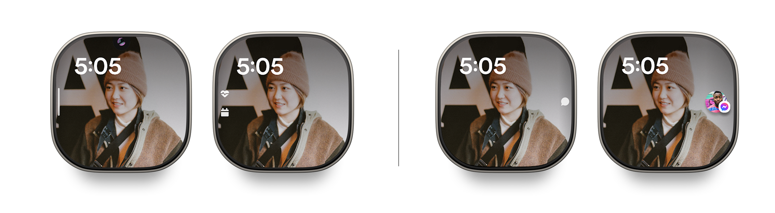
Insights into glanceable notifications
We also tested indicators — from generic dots to app-icon indicators to information-rich, context-carrying ones — and pushed toward the richer end.
The principle: an indicator should let you decide whether to raise your wrist before you raise it. A dot makes you check. A rich indicator answers the question on the face. On a device built around glanceability, that distinction is the whole product.
We also tested interactive, more expressive chatheads that updated in real-time
Research proved mostly positive with some room for improvement
The 4-directional model worked.
Participants found it learnable and intuitive; the location of Control Center and the panels matched their mental models. → Kept it as the backbone.
The notifs/comms split was well-liked — separating the streams made each feel calmer and more focused.
…but it confused some. People weren't sure what counted as "communication," and the split made "catching up on everything" harder. iMessage's constraints were hard for nearly everyone to grasp.
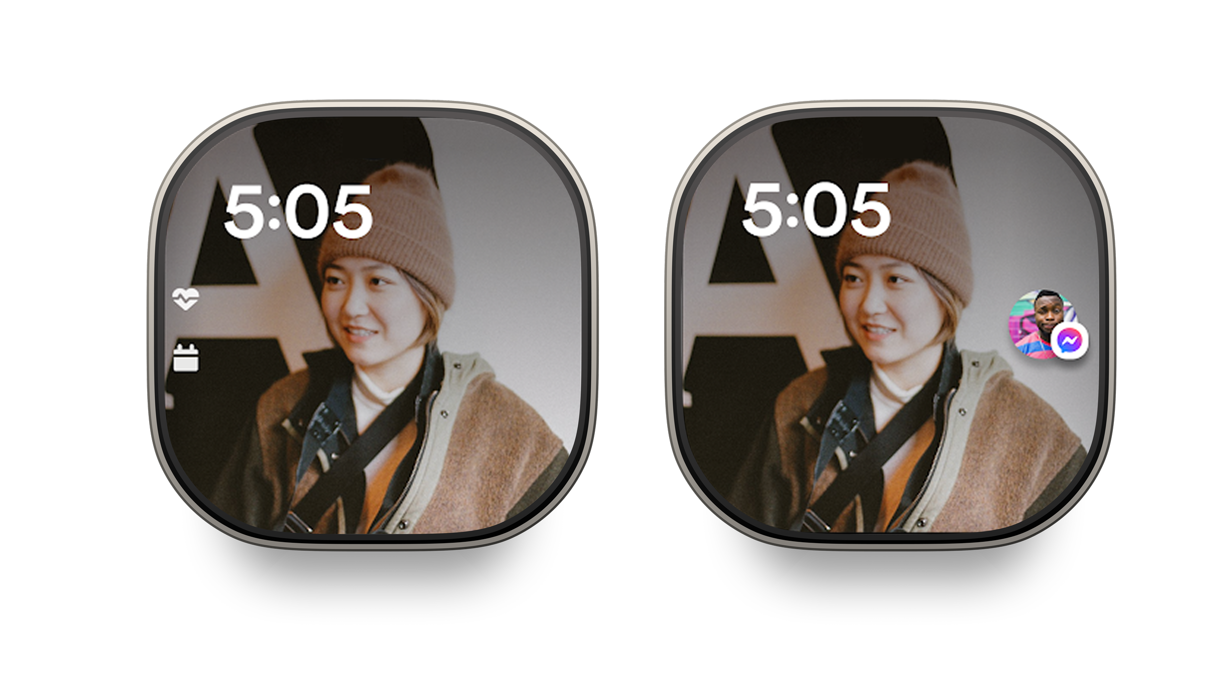
Rich indicators helped people stay in the moment
Anything that conveyed deeper context without raising the wrist beat generic dots. → Committed to the context-rich direction.
Interactive chat “heads” under-delivered. Interest in the mechanics, but real questions about multi-chat, privacy, and available actions. → Deprioritized.
Aligning on a path forward: Partnering with XFN and tuning navigation
The split tested well but created a real gap: people couldn't "catch up on everything" in one place.
So I used the finding to renegotiate with the messaging team — getting messages included inside the Notifications Center, counter to the initial conviction- replacing the bottom panel which previously was shortcuts and gallery.
Outcomes and metrics
50
Internal dogfooders
6%
Increase in NPS from dogfooder survey
3+
Milestones for software cut achieved against ship timelines
12
teams aligned internally across feature teams
300+
Bugs fixed across OS within 6 months
Outcome
The hardware has been indefinitely delayed and I have since left to other teams at Meta, but the software continues to be in development for future hardware experiences.
In the months following, we continued to test and iterate the spatial model and hardware navigation, we made slight tweaks throughout the experience running tests on usability based on the evolving product portfolio.
Looking ahead – Building OS foundations on top of the spatial model & navigation
With the navigation model aligned, I turned my focus to building out the detailed, rigorous interactions between hardware and software across:
App navigation & hardware shortcuts
Scroll motion, recent applications, favorite apps
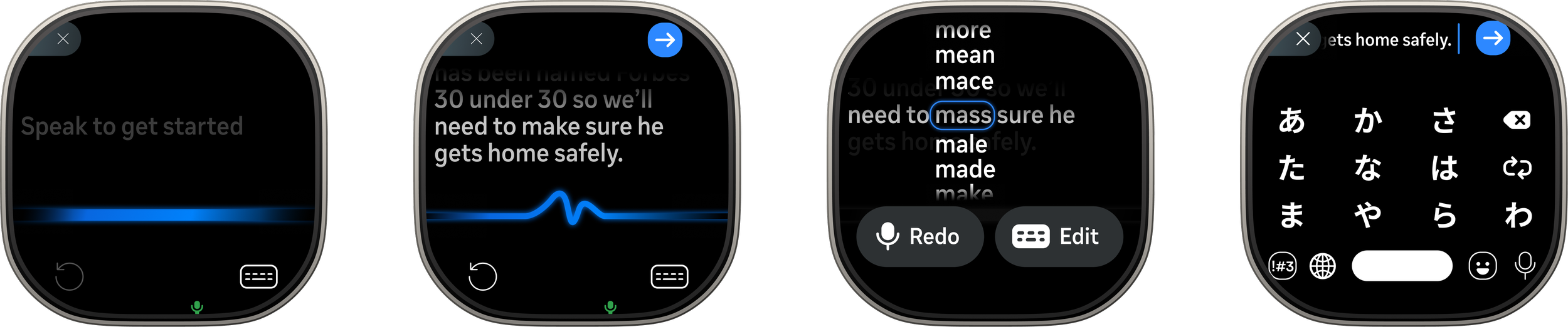
Inputs
Designing keyboards, editing, autofill, voice dictation
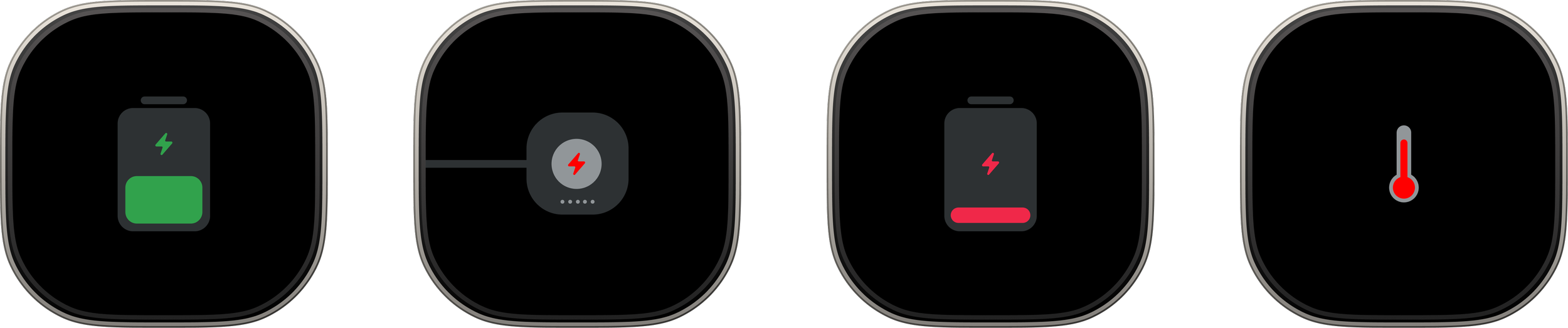
Device States, system & controls
AOD, charging, low power, system modes, indicators, face management
Reflection
Looking back, this was an interesting exercise of designing against constraints and limitations of hardware on tight timelines to test out new models for interacting with wearable devices.
If I were to do this all over again, I would take more time to challenge the design system and patterns I inherited, and be more bold in exploring new interaction patterns. Sadly, the timelines at the time and requirements did not allow for it.